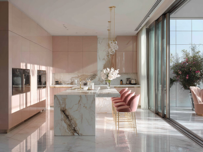
Pink in the kitchen sounds bold, maybe even risky. But step into a home with pink kitchen cabinets done right, and you’ll feel something special—warmth, light, and a touch of personality you can’t fake.
So is this a genius design move or a fast-fading trend you’ll regret by next spring?
Let’s break it down in plain language and show you how to make pink work beautifully in real kitchens, on real budgets, without risking a costly do-over.
TL;DR (If You’re Skimming)
Pink kitchen cabinets can be genius when:
- You pick the right shade (soft blush or earthy rose beats neon).
- You keep the palette balanced (neutral walls, warm metals).
- You choose timeless shapes (Shaker, slab) and classic counters (white, wood, marble-look).
- You plan an exit strategy (paint, not permanent).
It becomes a regret when:
- The pink is too bright or too cold for your light and flooring.
- Everything is trendy at once (pink + busy backsplash + loud hardware).
- There’s no plan for maintenance or resale.
Why Pink in the Kitchen Works (When It Works)
1) Pink makes a room feel warm and welcoming. Unlike stark white or cold gray, soft pink reflects light with a gentle glow. It flatters skin tones, calms the space, and pairs well with natural textures like wood and rattan.
2) Pink plays nicely with neutrals. Blush and dusty rose sit between beige and peach, so they blend with warm whites, creams, greiges, and even charcoal. That means your counters, floors, and appliances can stay simple and still look styled.
3) Pink photographs beautifully. If you share your home online or list it for sale later, pink reads clean and modern on camera—especially in matte paints. It makes a strong first impression without shouting.
The Biggest Fear: Will I Hate It in a Year?
You won’t—if you keep the foundations timeless. The trick is to treat pink as color, not theme. That means:
- Use a classic cabinet style (Shaker or flat slab) instead of trendy door details.
- Pick simple hardware (brushed brass, matte black, or polished nickel).
- Choose quiet counters (white quartz, wood, or marble-look with subtle veining).
- Keep the backsplash calm (white subway, zellige in cream, or a very soft pattern).
This way, the color can shift over time with small tweaks—new hardware, fresh décor, or even a new coat of paint—without a full renovation.
Choosing Your Pink: Shades That Feel Grown-Up
Not all pinks are equal. Here’s a simple cheat sheet:
- Blush / Ballet Pink: Light, airy, and sophisticated. Great for small kitchens or rentals.
- Dusty Rose / Mauve: Slightly grayed pink that feels earthy and modern. Pairs well with wood tones and black.
- Peachy Pink: Warm and sunny; beautiful with brass, cream, and light oak.
- Coral Pink: Energetic and fun; best as an accent (island only) or in well-lit spaces.
- Bubblegum / Hot Pink: High risk. Use sparingly—like on bar stools or open shelving—unless you truly love drama.
Pro tip: Test paint swatches on cardboard and move them around the room for a week. Check in the morning, noon, and night. Pink shifts a lot with light.
Best Color Pairings (That Don’t Fight Pink)
- Counters: White quartz, honed marble-look, butcher block, or light concrete.
- Walls: Soft white, warm cream, or pale greige.
- Floors: Natural oak, medium walnut, light terrazzo, or neutral tile.
- Hardware: Brushed brass for warmth, matte black for contrast, polished nickel for classic shine.
- Appliances: Stainless for timeless, white for airy, black for bold contrast.
Layout Ideas: Where to Put the Pink
All Lower Cabinets, White Uppers: Grounds the room and keeps the top half bright. Ideal for small spaces.
Just the Island: A pink island acts like a statement piece without overpowering the room.
All Cabinets Pink (Soft Tone Only): If you go full pink, keep everything else quiet: white walls, simple tile, and restrained hardware.
Pantry or Coffee Nook: A pink “moment” in a niche is the safest way to test the look.
Finishes & Textures That Elevate Pink
- Matte or Satin Paint: Hides fingerprints better than high gloss.
- Wood Accents: Open shelves, cutting boards, or wood stools add organic balance.
- Textured Tile: Cream or off-white zellige brings life without stealing the show.
- Warm Metals: Brass or bronze tones add depth and prevent the room from feeling flat.
Small Kitchen? Pink Can Help.
In tight spaces, blush lowers visual noise. Try:
- Pink lowers + white uppers to lift the eye.
- A panel-ready dishwasher so the cabinet color flows.
- Under-cabinet lighting to keep pink from reading gray at night.
- Keep the backsplash and counters simple to avoid clutter.
What About Resale Value?
Buyers react to condition and cohesion more than any one color. Pink kitchen cabinets can sell if they look fresh, well-painted, and part of a balanced scheme. If you’re worried:
- Choose soft, neutral-leaning pinks.
- Paint instead of replacing—easy to reverse.
- Keep the rest of the palette classic so new owners can swap color later.
Budget Path: Pink Without the Price Pain
You don’t need custom cabinetry to get the look.
- Repaint Existing Cabinets
- Clean, sand lightly, prime with a bonding primer, and finish with a cabinet-grade enamel.
- Upgrade hinges and slides for a “new kitchen” feel.
- Swap Just the Fronts
- Keep the boxes; replace doors/drawer fronts in a paint-ready finish.
- Paint fronts pink, leave boxes white—big visual impact, smaller cost.
- Paint the Island Only
- One weekend, one gallon, major style.
- Temporary Pink
- For rentals, try removable vinyl on flat door fronts or pink hardware and décor accents.
Maintenance: Keeping Pink Looking Fresh
- Matte or Satin finishes hide small dings and wipe clean with mild soap.
- Avoid harsh scrubbers; use microfiber cloths.
- Touch-up kit: Keep a small labeled jar of your exact paint for quick fixes.
- Add soft-close hardware to reduce chips from slams.
Common Mistakes (And Easy Fixes)
Mistake 1: Picking a cold, blue-leaning pink under warm floors.
Fix: Choose a warm blush with a hint of beige so it plays well with oak or walnut.
Mistake 2: Pairing pink with busy, colorful tile.
Fix: Let pink be the star. Choose quiet tile and add color with art or dishware.
Mistake 3: Gloss paint that shows every fingerprint.
Fix: Go satin for wipeability and a soft look.
Mistake 4: Matching every accessory to the cabinets.
Fix: Contrast adds style. Mix in black, white, wood, and metallics.
Sample Palettes You Can Steal
Soft & Airy
- Cabinets: Blush pink
- Walls: Warm white
- Counters: White quartz
- Hardware: Brushed brass
- Floors: Light oak
Modern & Moody
- Cabinets: Dusty rose
- Walls: Cream or pale greige
- Counters: Marble-look with subtle gray veins
- Hardware: Matte black
- Floors: Medium walnut
Coastal Light
- Cabinets: Peachy pink
- Walls: Cloud white
- Counters: Butcher block
- Hardware: Polished nickel
- Floors: Light tile or white oak
Bold Island Only
- Main Cabinets: White
- Island: Coral pink (muted)
- Counters: White quartz
- Hardware: Brass
- Floors: Natural oak
Pink + Materials: What Actually Matches
- With White Quartz: Go blush or dusty rose for soft contrast.
- With Marble-Look Counters: Dusty Pink kitchen cabinets reads sophisticated, not sweet.
- With Butcher Block: Peachy pink and brass sing together.
- With Concrete: Mauve-rose brings warmth to cool gray.
- With Black Appliances: Dusty rose + matte black = sharp and modern.
Island or Uppers? How to Decide
- Pink Lowers Only: Best for balance and resale; anchors the room.
- Pink Uppers Only: Riskier; can feel top-heavy unless the lowers are very light.
- Pink Island: Safest statement. Works in almost any style of kitchen.
Style Guide: Make It Yours
Scandi Minimal: Flat-slab blush cabinets, white counters, birch stools, linear pulls, and a single branch in a vase. Calm, bright, and modern.
Transitional Classic: Shaker dusty rose pink kitchen cabinets , honed marble-look tops, soft brass knobs, cream zellige tile. Warm, timeless, not fussy.
Playful Creative: Coral-pink island, open oak shelves, patterned runner, matte black pulls. Keep walls white so it doesn’t overwhelm.
DIY vs. Pro: What to Know
DIY Painting
- Use a bonding primer and cabinet-grade enamel.
- A small HVLP sprayer gives a smoother finish than a brush.
- Label doors and hardware in zip bags to avoid chaos.
When to Hire a Pro
- If your cabinets are glossy or damaged.
- If you want a factory-smooth finish or a sprayed lacquer.
- If time is tight and mistakes will cost more.
FAQs
Will pink make my kitchen look childish?
Not if you choose muted shades and stick with simple lines and elevated materials. Think “warm modern,” not “nursery.”
Can I mix pink with wood cabinets?
Yes. Try pink on the island with wood on the perimeter, or vice versa. Keep the undertones warm across both.
What backsplash works best?
White subway, cream zellige, or a very light stone. Let the cabinets lead.
Is pink okay in a dark kitchen?
Yes—but pick warmer pinks and add strong lighting (under-cabinet, pendants). Avoid cool, gray-leaning pinks.
How easy is it to repaint later?
Very. That’s the beauty of going pink with paint, not permanent materials.
So… Genius or Regret?
Genius—if you treat pink like a classic color, not a passing fad. Stick to soft, grown-up shades. Pair with timeless materials. Keep the lines clean. Build your kitchen like a great outfit: balanced, comfortable, and a little bit brave. Do that, and pink cabinets won’t feel like a trend at all—they’ll feel like you.
Your Next Step
- Start with sample boards: one pink paint, one neutral wall, a counter sample, and your floor tone.
- Test in a different light for at least three days.
- If you’re nervous, paint the island first. You might stop there—and love it.
Pink isn’t just a color. In the kitchen, it’s a mood: calm, warm, and quietly confident. When chosen well, it doesn’t shout. It glows. And that might be the smartest design choice you make this year.

