Home decor is what makes your house cozy and comfortable. But having too many decorations can make your home look cluttered and messy.
If you want a home that is inviting but does not look crowded, we have listed down nine decorating mistakes you need to avoid:
1. Adding to Many Stuff
Nothing can make a room look cluttered other than having too many stuff.
When decorating a house, it would help to consider the size of your room and your items.
When you place a king-sized bed in 6 feet by 9 feet bedroom, it will not make sense. That’s because you are not leaving enough room for other pieces of furniture like a closet and vanity mirror with a table.
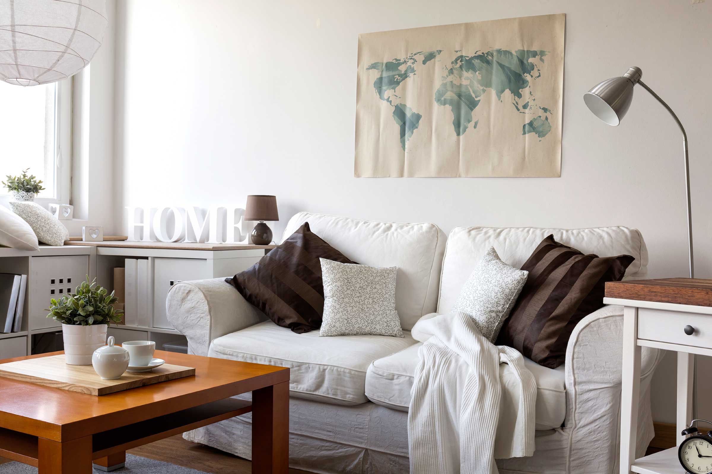
Another thing to keep in mind is that you should not leave your stuff on the floor. Allow some of the items to float by adding a floating shelf or hanging them from the ceiling.
2. Using Many Color Palettes
When you use too many colors, it can make your room look messy.
Say, you want to change the wall color of your bedroom. A rule of thumb to follow is to use two hues and combine it with a neutral color.
For example, two different shades of blue and white paint colors.
Doing so can help you achieve a cohesive look for your bedroom. Meanwhile, the neutral color can help make your room look spacious.
PRO TIP: Pick a theme for your house or room when choosing your wall colors.
3. Exposing the Wires and Cords
You may have fancy-looking pieces, but an exposed black wire can make everything look ugly.
Thus, it would be best to hide your wires and cords, which we also tell our clients at Maid Sailors Home Cleaning Services NYC.
Here are some quick and smart tips for doing that:
- Hook the cords at the back of the furniture
- Use plastic track wire covers or cable wrap
- Slip them in the drawers
- Conceal them using baseboard trimmings
- Run the wires behind the wall
4. Adding Too Many Decorative Pillows
An accent pillow is one way to add interest to your sofa. But having too many of it can make your living room look distracting. Plus, your guest might think that your interior design scheme was not well-thought-out.
What you can do instead is pick decorative pillows with complimentary colors. It will also help if you consider your chair or sofa.
Two accent pillows on each side of the sofa will do. If you have a couple of single-sitter in your living room, use similar decorative pillows for a uniformed look.
5. Skimping on Rug Size
Sometimes, a rug can make an entire room look cohesive. That’s why it is essential to use a rug with an appropriate size and color.
Sure, smaller rugs are more affordable. But investing in the most massive rug that is appropriate for your space is ideal.
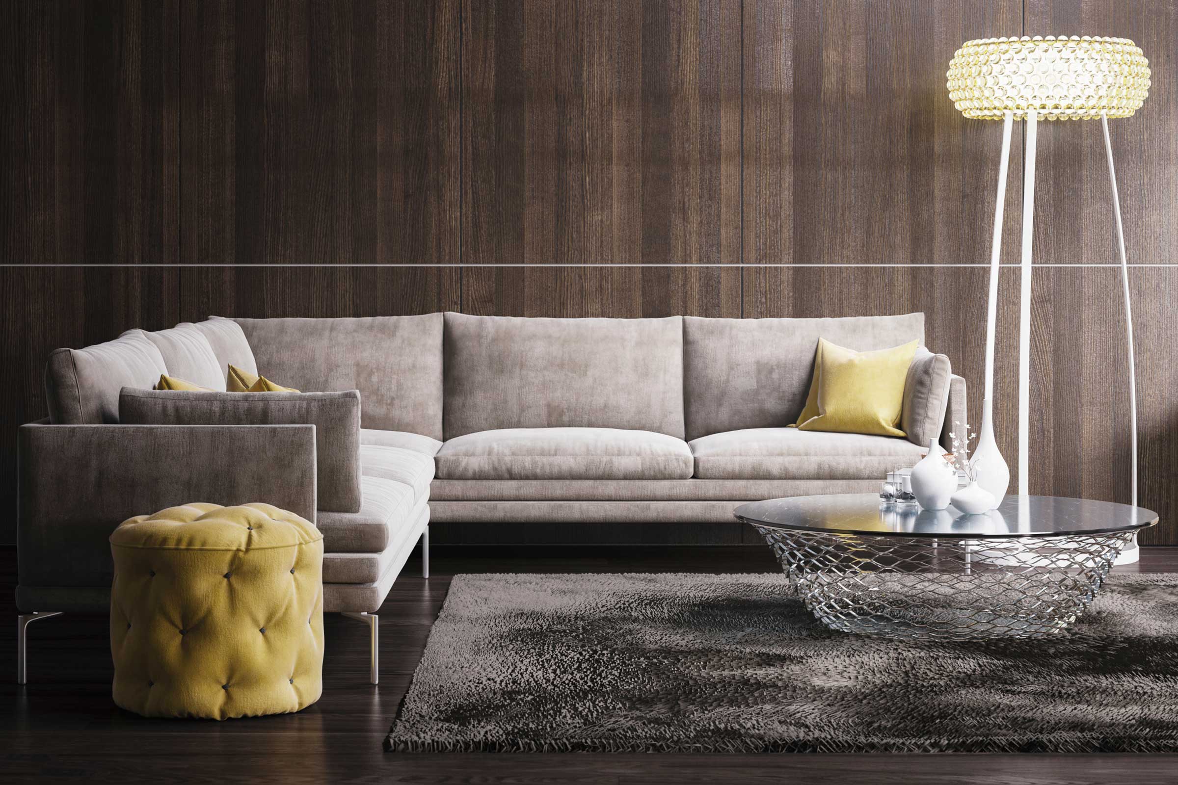
For one, it makes the room look polished. Second, it gives the illusion that a room is spacious.
The right rug size plus thoughtful furniture placements can result in a clean and pulled-together look.
6. Pushing Everything Against the Wall
It is common to assume that pushing furniture pieces against the wall can make your house look spacious. What people do not know is that it leaves awkward space.
What you can do instead is pull towards the center of the room. Use them to create a defined space, like an entertainment area. Doing so can make a room more inviting and cozy.
And you might not believe it, but pulling your furniture away from the wall can make your space look bigger.
7. Adding too Many Shelf Items
Other than serving as a storage area, your shelf can be an interesting conversation starter. It can also be a wall accent.
But you do not want your shelves to be infamous for being cluttered.
That said, it would be better if you only display items that are functional and you love. You also have to keep in mind that shelves as storage areas.
What you can do is organize your items vignette style. You can also use a color palette when arranging your stuff.
Another trick is to use the “cantaloupe method.” This means that you should not place items that are smaller than a cantaloupe on your shelf.
8. Using Too Many Table Decor
Table decors can also make your house look cluttered. It is like telling the people in your home that they do not have any place to eat.
To solve this, we suggest that you edit your table decors. Only pick the piece that you love and arrange them in vignette-style or one grouping.
Imagine adding a fruit basket at the center of the table. It adds a pop of color for your table while ensuring that you have a decent place to enjoy a meal.
If you want your table to look festive for some reason, consider placing a three-pronged candle holder in the middle. And then add some garland at the base.
9. Matching Everything
Sure, you want to achieve a cohesive look in your house. But making everything match will not help.
Imagine a living where everything is blue: Blue walls, blue sofa, blue pillows, blue curtains, blue center table, and more.
Take a space’s theme into consideration.
Say, you want a Scandinavian theme for your living room. This can mean that you have a predominantly white wall. To make it look lively, what you can do is to hang colorful photos on the wall.
For a cohesive, ensure that your photo frames are the same color. For instance, a color photo in a black frame can add a pop of color on a white wall.
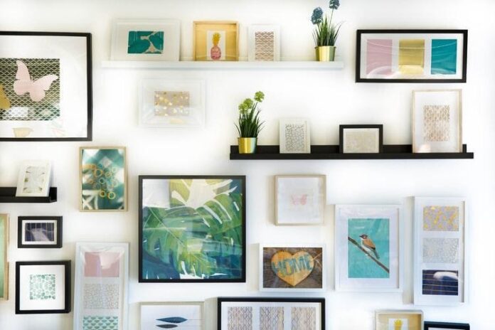
10. Hanging Pictures at Random
Photos and wall arts are a great way to showcase your personality. But hanging them at random can lead to a chaotic-looking wall.
Thus, it would be ideal to group your photos in a wall gallery arrangement. Sometimes, it will look better if you have the right mix of big and small frames.
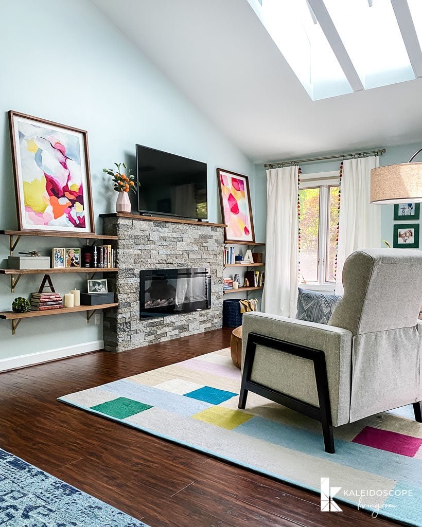
Another tip is to use frames that have the same color. That way, your wall will look clean. The color of the frame will also define the space that your images and wall arts occupy.
No one wants to live in a cluttered space. Hence, it is vital to plan how you will decorate your house. Doing so can prevent you from doing the design mistakes listed above.

