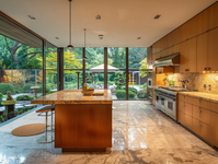
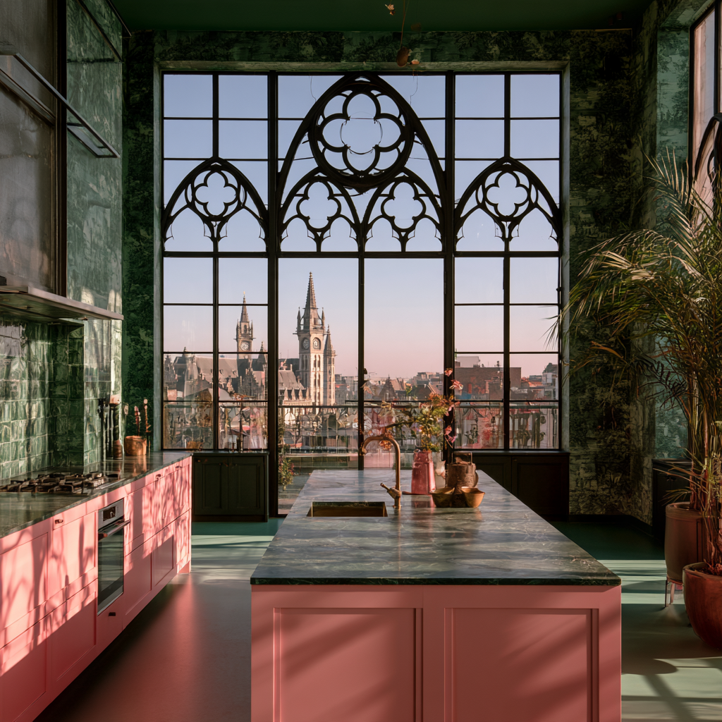
Picture a garden in June. Peonies, roses, a tangle of leaves around every bloom. Nobody stands in that garden and says, “Hmm, the pink and green are clashing.” Nature figured this pairing out a long time ago. Designers are just catching up, and pink kitchen cabinets set against green walls are one of the most charming ways to bring that garden feeling indoors.
If the idea makes you a little nervous, that’s fair. Pink cabinets sound bold. Green walls sound bold. Both at once? It sounds like a dare. But when you pick the right shades and balance them with the right materials, the result feels warm, grown-up, and surprisingly calm. Here’s how to make it work in your own kitchen.
Why Pink and Green Get Along So Well
The short answer is the color wheel. Pink is a tint of red, which simply means red with white mixed in. Red and green sit directly across from each other on the wheel, which makes them complementary colors. Complements make each other look richer. Your pink looks pinker next to green, and your green looks greener next to pink.
There’s a temperature story too. Color consultant Amy Krane, speaking to Livingetc, explained that pink reads as warm because it comes from red, while green tends to lean toward its parent color, blue. Put a warm color beside a cool one and you get balance. The contrast is real, but it stays soft. That’s the magic trick here. You get energy without the kitchen feeling loud.
Krane also pointed out that not every pink plays nicely with every green. A salmon pink leans orange, so it pairs well with greens that carry lots of blue, like mint or dark teal. That’s because orange and blue are complements too. Meanwhile, a hot pink or magenta looks great beside a deep, saturated green because the two match in intensity. As she put it, “Context is so important when deciding which shades of pink and green to combine.”
Pink Kitchen Cabinets Are Having a Real Moment
This isn’t a passing internet fad. Paint brands have been nudging us toward rosy shades for years. Benjamin Moore named First Light 2102-70, a soft and rosy pink, its Color of the Year for 2020. Around the same time, the brand’s UK team noted that neutrals with pink and red undertones were starting to replace cool grays in people’s homes.
On the green side, Sherwin-Williams picked Evergreen Fog SW 9130 as its 2022 Color of the Year. The company describes it as a gray-green with a touch of blue. So in just a few years, both halves of this pairing got the spotlight.
Farrow & Ball, the British paint maker, has even shared groups of pink-and-green kitchens on its own channels. Most showed green cabinets with pink walls. Flipping that recipe, with the pink on the cabinets and green on the walls, is the fresher move. It puts the color you touch every day right at your fingertips.
Shade Pairings That Actually Work
Here’s where the fun starts. Below are pairings built from real, named paint colors. Always test samples in your own light before you commit, since a color that looks perfect in a showroom can turn odd under your kitchen bulbs.
Soft and Dusty
For a calm, lived-in look, go muted on both sides.
- Setting Plaster No. 231 cabinets with Breakfast Room Green No. 81 walls (both Farrow & Ball). Setting Plaster is a dusky pink that design writers often call surprisingly neutral. Breakfast Room Green is a warm, herb-like green with yellow undertones. Together they feel like an old English cottage.
- Templeton Pink No. 303 cabinets with French Gray walls (Farrow & Ball). Templeton Pink has gray undertones, and French Gray shifts between green and gray as the light changes. This one is quiet and easy to live with.
- First Light 2102-70 cabinets with Evergreen Fog SW 9130 walls. Mixing brands is totally fine. A blush pink against a soft gray-green feels modern and relaxed.
Rich and Moody
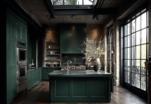
Want drama? Pair a dusty pink with a deep green. Sulking Room Pink No. 295 is a muted rose with plenty of warmth. Set it against a very dark green like Farrow & Ball’s Studio Green, which the brand offers as its deepest green, and the room feels like a jewel box. The dark walls make the pink glow.
Bright and Playful
If you’re the kind of person who owns a hot pink raincoat, lean in. Krane’s rule about matching intensity matters most here. A bold pink cabinet needs an equally confident green, like a rich emerald, or the pink will overpower the walls and the room will feel lopsided.
Balancing the Room So It Doesn’t Feel Like a Candy Store
Two strong colors need some neutral breathing room. Think of your neutrals as the bread in a sandwich. Without them, things get messy fast.
Countertops
White or cream stone is your best friend. A honed white marble or a warm quartz with soft gray veining gives the eye a place to rest. If you love movement, try a stone with faint green veins. It ties the walls and counters together without adding another color.
Floors
Warm wood floors in oak or walnut tones keep everything grounded. Checkerboard tile in cream and soft green is a playful option that nods to vintage kitchens. Skip cool gray tile, which can make dusty pinks look muddy.
Hardware
Unlacquered brass is the classic choice here. It warms up over time, picks up the yellow notes in many greens, and makes pink look a bit more refined. Polished nickel works if you want something crisper. Matte black can feel harsh against soft pinks, so use it sparingly, maybe on a faucet or light fixture.
Lighting
Bulb color matters more than most people think. Warm white bulbs flatter pink. Very cool, bluish bulbs can make it look chalky or even a little gray. If your kitchen gets little natural light, Farrow & Ball ambassador Patrick O’Donnell has noted that Templeton Pink brings gentle warmth to darker rooms.
Choosing the Right Finish
Paint finish isn’t glamorous, but it makes a huge difference in a kitchen. Cabinets take a beating from greasy hands, splashes, and the occasional flying spaghetti sauce. O’Donnell recommends Farrow & Ball’s Modern Eggshell for cabinetry and trim, and Modern Emulsion for walls, which is washable and wipeable.
The general rule works across brands: use a slightly shinier finish on cabinets so they can be scrubbed, and a flatter finish on walls so the color looks soft and deep. A matte green wall next to a gently glowing eggshell pink cabinet also creates a nice contrast in texture, which adds depth without adding more color.
If you’re buying new cabinets instead of painting old ones, look for factory finishes. They tend to hold up better than a weekend DIY job, and you skip the sanding. It’s worth browsing a few ready-made pink kitchen cabinets to see how different shades and door styles look in real kitchens before you settle on a paint chip.
Mistakes to Avoid
Even great color pairs can go wrong. Here are the most common slip-ups.
- Matching the intensity wrong. A pale blush next to a neon green looks like an accident. Keep both colors at a similar level of softness or boldness.
- Going too sweet. O’Donnell’s advice is to choose earth-toned pinks, or as he put it, “pink kitchens, but not Barbie pinks.” Dusty, grayed pinks age better.
- Forgetting the undertones. A pink with orange undertones and a green with yellow undertones can both read warm, so the room may lose its balance. Pair a warm pink with a cooler green for that push-and-pull.
- Skipping samples. Paint a big swatch on the actual wall and a scrap board for the cabinet color. Look at both in the morning, afternoon, and at night.
- Adding too many accent colors. Pink and green are already doing the talking. Let wood, stone, and metal handle the rest.
Small Ways to Test the Look First
Not ready to commit your whole kitchen? Start small. Paint just the island pink and leave the perimeter cabinets white. Or paint one green accent wall behind open shelving. You could also try a pink pantry door, a green backsplash tile, or even a pair of pink bar stools.
Living with a small dose for a few weeks will tell you a lot. If you find yourself smiling every time you walk in for coffee, you’ll know it’s time to go further. If it starts to feel like too much, you’ve only repainted one door.
FAQ
Do pink kitchen cabinets look dated?
Not if you pick the right shade. The bubblegum pinks of the 1950s can feel retro, which is great if that’s your goal. Dusty, muted pinks like Setting Plaster or Sulking Room Pink feel current and calm, especially with natural stone and brass.
What shade of green goes best with pink?
It depends on the pink. Krane’s guidance is a good start: salmon pinks pair well with blue-leaning greens like mint or teal, while bold pinks need deep, saturated greens. For soft dusty pinks, try a muted sage or gray-green.
Is pink a good cabinet color for a small kitchen?
Yes, a soft pink cabinets can make a small kitchen feel warmer and more inviting. Keep the walls in a lighter green, use warm white bulbs, and pick pale countertops to keep things bright.
Should the pink go on the cabinets or the walls?
Both work. Pink on the cabinets makes the color the star and keeps it close to eye level. Pink on the walls with green cabinets is the more common route and slightly safer.
Bring the Garden Home
Pink and green have been sharing space in flower beds forever, and they can share your kitchen just as happily. Pick shades that match in mood, give them some neutral breathing room, and choose a finish that can handle real life. Then pour a cup of coffee, stand in your new kitchen, and enjoy the fact that you were brave enough to try something a little unexpected. It’s a lot like getting flowers every morning, minus the vase water.